Navigating the Reports Page
This guide walks you through how to open the Dashboard and what you'll find on the page. For a broader introduction to what the Dashboard is and who can access it, see the Overview.
Opening the Dashboard
Click Dashboard in the sidebar navigation. It's the first item in the menu, marked with a chart icon.
The Dashboard opens and immediately loads your data for the current month.
Default Date Range
Every time you open the Dashboard, it automatically filters to the current calendar month — from the first day of the month through today. This means you see a running view of the current month's activity without needing to set any filters manually.
You can change the date range at any time using the filter bar. For details on how filters work, see Filtering Reports.
Page Layout
The Dashboard is organized into four sections, arranged top to bottom. All sections respond to the same filters — changing a filter updates everything on the page at once.
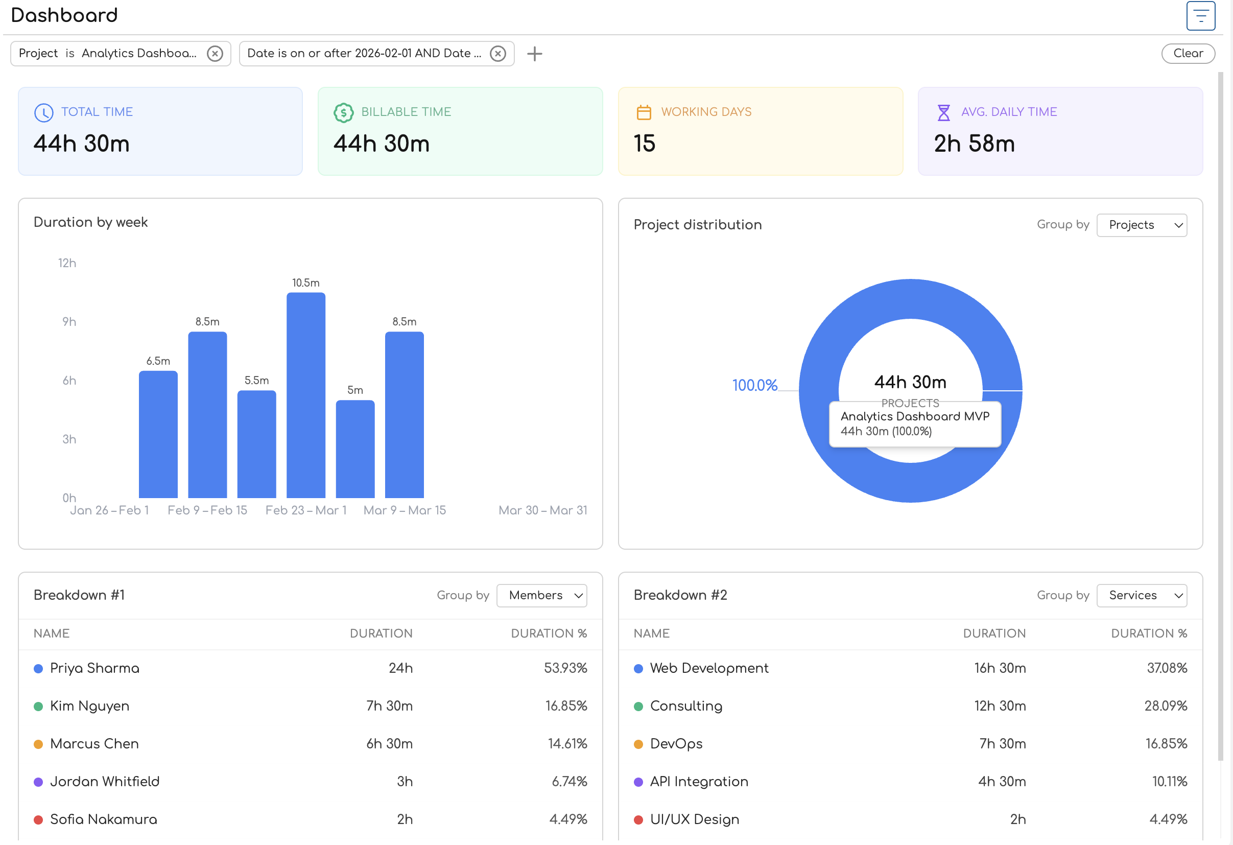
1. Filter Bar
At the very top of the page, below the "Dashboard" heading, sits the filter bar. It shows any active filters as chips — by default, you'll see a date range chip for the current month. You can add filters for projects, clients, services, and (if you're an admin or owner) team members.
2. Summary Cards
Below the filter bar, four color-coded cards display key metrics for the filtered period:
| Card | Color | What It Shows |
|---|---|---|
| Total Time | Blue | Total duration of all time entries |
| Billable Time | Green | Duration of entries linked to billable services |
| Working Days | Amber | Number of distinct dates with at least one entry |
| Avg. Daily Time | Violet | Total time divided by working days |
On wider screens the cards sit in a single row. On smaller screens they stack into a two-by-two grid.
For a detailed explanation of how each metric is calculated, see Understanding Summary Statistics.
3. Charts
Below the summary cards, two charts sit side by side:
-
Duration bar chart (left) — shows how tracked time is spread across the date range. The chart title changes based on the time span: "Duration by day", "Duration by week", or "Duration by month". Hover over a bar to see the exact duration. See Duration Chart for details.
-
Distribution donut chart (right) — shows how tracked time is proportionally divided among projects, clients, team members, or services. A Group by dropdown above the chart lets you switch the dimension. The center of the donut displays the total duration. See Distribution Chart for details.
On smaller screens, the charts stack vertically instead of sitting side by side.
4. Breakdown Tables
At the bottom of the page, two tables provide a tabular view of your time data:
- Breakdown #1 (left) — a table with rows for each entity (project, client, team member, or service), showing duration and percentage of total.
- Breakdown #2 (right) — a second table with its own Group by dropdown, so you can view two different groupings at the same time.
Each table has a color indicator next to each entity name that matches the donut chart's color scheme, making it easy to cross-reference the chart and table visually. A totals row at the bottom of each table shows the combined duration and 100%.
For more on the table columns and grouping options, see Breakdown Table.
Putting It Together
A typical workflow on the Dashboard looks like this:
- Open the Dashboard from the sidebar — it loads the current month automatically.
- Glance at the summary cards to check total hours, billable hours, and daily averages.
- Scan the duration chart to see if time was logged consistently or if there are gaps.
- Check the distribution chart to see which projects or clients are consuming the most time.
- Drill into the breakdown tables — set one to "Projects" and the other to "Services" to compare groupings side by side.
- Adjust filters if you need a different date range or want to focus on a specific project or client.
If you're an admin or owner, you'll see data for the entire organization and can filter by team member. Regular team members see only their own time entries. For more on these differences, see Admin vs Team Member Reports.