Overview
The Dashboard gives you a visual summary of how your team's time is being spent. It takes the time entries your team has logged and presents them as charts, tables, and summary cards — so you can quickly understand totals, spot trends, and see how work is distributed across projects, clients, team members, and services.
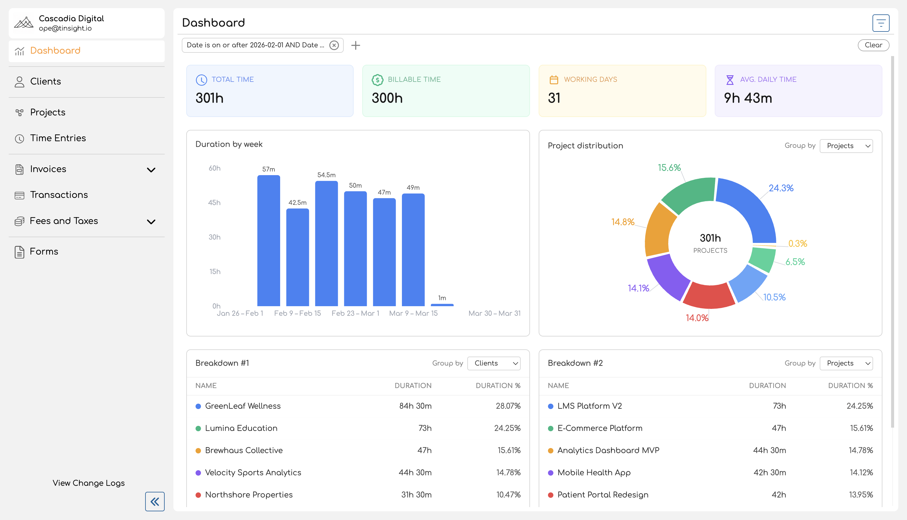
You'll find the Dashboard in the sidebar navigation. When you open it, it loads the current month's data by default and shows four main sections: summary cards at the top, a duration chart, a distribution chart, and two breakdown tables.
Summary Cards
Four cards at the top of the page give you an at-a-glance view of the filtered period:
| Card | What It Shows |
|---|---|
| Total Time | The total duration of all time entries in the selected period. |
| Billable Time | The total duration of time entries linked to a billable service. Entries without a service are treated as non-billable. |
| Working Days | The number of distinct dates that have at least one time entry. This counts actual days worked, not calendar days. |
| Avg. Daily Time | Total time divided by working days — an average of how much time was logged per active day. |
All four cards update immediately when you change filters.
Duration Chart
Below the summary cards, a bar chart shows how tracked time is distributed over the selected period. Each bar represents a time segment (a day, a week, or a month), and its height reflects the total time logged during that segment.
The chart automatically chooses the right level of detail based on the date range you're viewing:
| Date Range | Grouping | Example Labels |
|---|---|---|
| 7 days or fewer | Daily | Mar 24, Mar 25, ... |
| 8 to 90 days | Weekly | Mar 24 – Mar 30, Mar 31 – Apr 6, ... |
| More than 90 days | Monthly | March 2026, April 2026, ... |
Hover over any bar to see the exact duration for that period.
Distribution Chart
A donut chart shows the proportional breakdown of tracked time by a dimension you choose. Use the Group by dropdown above the chart to switch between:
- Projects — how time is split across projects
- Clients — how time is split across clients
- Members — how time is split across team members (admin view only shows meaningful differences here)
- Services — how time is split across services
Each slice displays its percentage of the total, and the center of the chart shows the overall total duration. Entries without an assigned service appear as "Unassigned", and entries on projects without a client appear as "No Client".
Breakdown Tables
Two side-by-side tables provide a tabular view of the same kind of data the distribution chart shows. Each table has its own Group by dropdown, so you can view two different groupings at once — for example, one table grouped by projects and the other by services.
Each table shows:
| Column | Description |
|---|---|
| Name | The project, client, team member, or service name, with a color indicator. |
| Duration | Total tracked time for that entity. |
| Duration % | The entity's share of total time as a percentage. |
A totals row at the bottom of each table shows the combined duration and 100%.
Filtering
A filter bar at the top of the page lets you narrow the data across all sections at once. Available filters include:
- Date — set a date range (defaults to the current month)
- Project — include only entries for specific projects
- Client — include only entries for projects belonging to specific clients
- Service — include only entries for specific services
- Member — include only entries for a specific team member (available to admins and owners only)
Filters use compound conditions, so you can combine criteria like "date after Mar 1 and date before Mar 15" in a single filter chip. Changing any filter updates all four sections — summary cards, charts, and tables — immediately.
For a detailed guide on using filters, see Filtering Reports.
Who Can Access the Dashboard
Every team member in your organization can access the Dashboard. What you see depends on your role:
| Capability | Team Member / Contributor | Admin / Owner |
|---|---|---|
| View Dashboard | Yes | Yes |
| Data shown | Own time entries only | All time entries across the organization |
| Filter by team member | No | Yes |
Team members and contributors see their own time data — useful for reviewing personal time allocation and billable hours. Admins and owners see organization-wide data, making it easy to review team utilization, compare project workloads, or check how time is distributed across clients.
For more on the differences between these views, see Admin vs Team Member Reports.
What's in This Book
| Page | Description |
|---|---|
| Navigating the Reports Page | How to access the Dashboard, understand the default date range, and orient yourself within the page layout. |
| Filtering Reports | How to use date, project, client, service, and member filters — including compound filter conditions. |
| Understanding Summary Statistics | What each summary card measures and how values like billable time and working days are calculated. |
| Duration Chart | How the bar chart works, including automatic granularity based on your date range. |
| Distribution Chart | How the donut chart breaks down time by projects, clients, team members, or services. |
| Breakdown Table | How the tabular breakdown works, including grouping options and the totals row. |