Reports
Visualize and analyze your tracked time with the reports dashboard. Learn how to filter by date range, project, client, or service, read summary statistics, and explore charts and tables that break down your hours by different dimensions.
- Overview
- Navigating the Reports Page
- Filtering Reports
- Understanding Summary Statistics
- Duration Chart
- Distribution Chart
- Breakdown Table
Overview
The Dashboard gives you a visual summary of how your team's time is being spent. It takes the time entries your team has logged and presents them as charts, tables, and summary cards — so you can quickly understand totals, spot trends, and see how work is distributed across projects, clients, team members, and services.
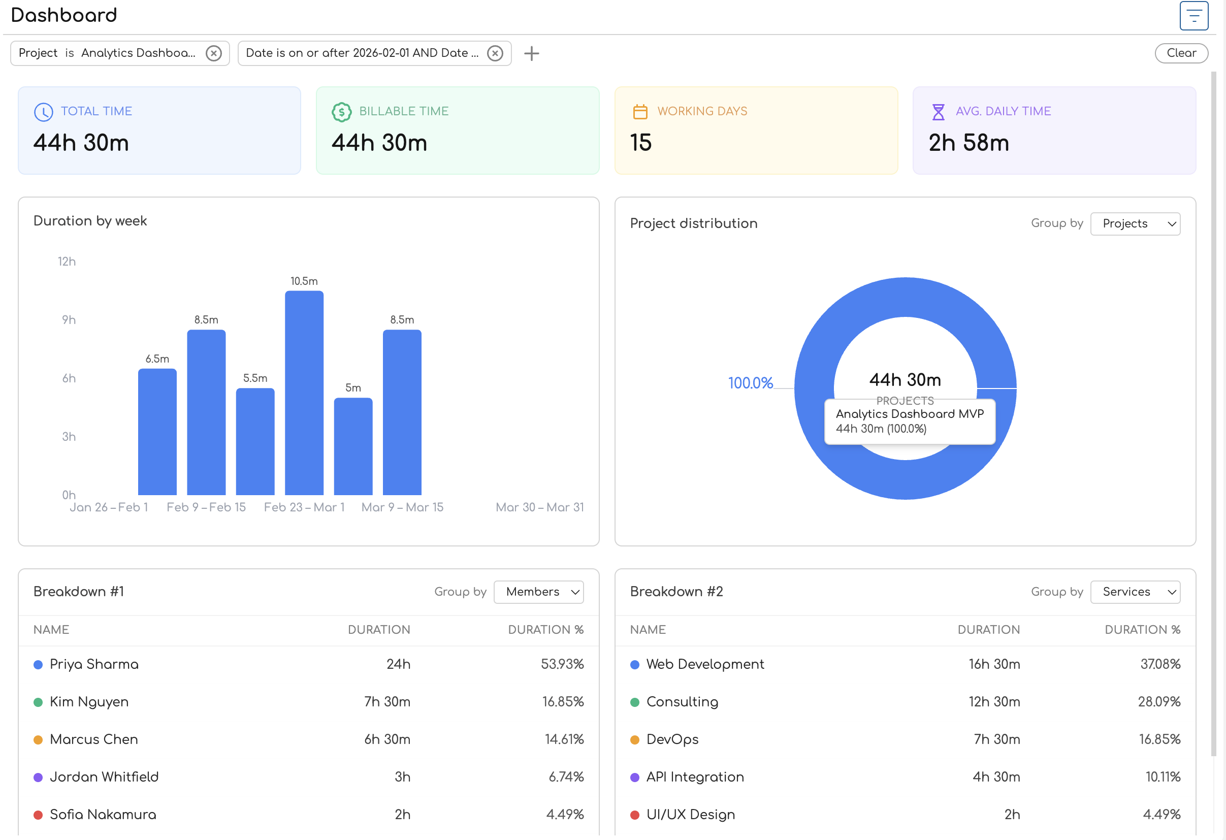
You'll find the Dashboard in the sidebar navigation. When you open it, it loads the current month's data by default and shows four main sections: summary cards at the top, a duration chart, a distribution chart, and two breakdown tables.
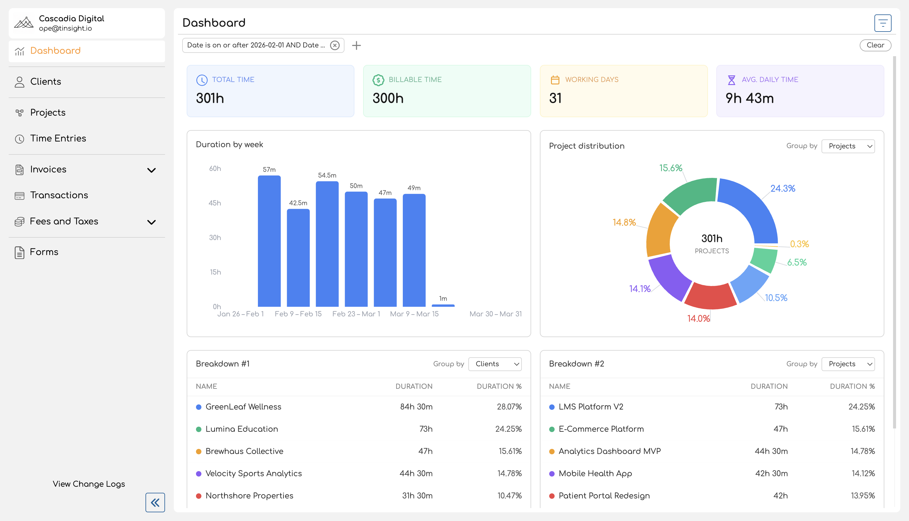
Summary Cards
Four cards at the top of the page give you an at-a-glance view of the filtered period:
| Card | What It Shows |
|---|---|
| Total Time | The total duration of all time entries in the selected period. |
| Billable Time | The total duration of time entries linked to a billable service. Entries without a service are treated as non-billable. |
| Working Days | The number of distinct dates that have at least one time entry. This counts actual days worked, not calendar days. |
| Avg. Daily Time | Total time divided by working days — an average of how much time was logged per active day. |
All four cards update immediately when you change filters.
Duration Chart
Below the summary cards, a bar chart shows how tracked time is distributed over the selected period. Each bar represents a time segment (a day, a week, or a month), and its height reflects the total time logged during that segment.
The chart automatically chooses the right level of detail based on the date range you're viewing:
| Date Range | Grouping | Example Labels |
|---|---|---|
| 7 days or fewer | Daily | Mar 24, Mar 25, ... |
| 8 to 90 days | Weekly | Mar 24 – Mar 30, Mar 31 – Apr 6, ... |
| More than 90 days | Monthly | March 2026, April 2026, ... |
Hover over any bar to see the exact duration for that period.
Distribution Chart
A donut chart shows the proportional breakdown of tracked time by a dimension you choose. Use the Group by dropdown above the chart to switch between:
- Projects — how time is split across projects
- Clients — how time is split across clients
- Members — how time is split across team members (admin view only shows meaningful differences here)
- Services — how time is split across services
Each slice displays its percentage of the total, and the center of the chart shows the overall total duration. Entries without an assigned service appear as "Unassigned", and entries on projects without a client appear as "No Client".
Breakdown Tables
Two side-by-side tables provide a tabular view of the same kind of data the distribution chart shows. Each table has its own Group by dropdown, so you can view two different groupings at once — for example, one table grouped by projects and the other by services.
Each table shows:
| Column | Description |
|---|---|
| Name | The project, client, team member, or service name, with a color indicator. |
| Duration | Total tracked time for that entity. |
| Duration % | The entity's share of total time as a percentage. |
A totals row at the bottom of each table shows the combined duration and 100%.
Filtering
A filter bar at the top of the page lets you narrow the data across all sections at once. Available filters include:
- Date — set a date range (defaults to the current month)
- Project — include only entries for specific projects
- Client — include only entries for projects belonging to specific clients
- Service — include only entries for specific services
- Member — include only entries for a specific team member (available to admins and owners only)
Filters use compound conditions, so you can combine criteria like "date after Mar 1 and date before Mar 15" in a single filter chip. Changing any filter updates all four sections — summary cards, charts, and tables — immediately.
For a detailed guide on using filters, see Filtering Reports.
Who Can Access the Dashboard
Every team member in your organization can access the Dashboard. What you see depends on your role:
| Capability | Team Member / Contributor | Admin / Owner |
|---|---|---|
| View Dashboard | Yes | Yes |
| Data shown | Own time entries only | All time entries across the organization |
| Filter by team member | No | Yes |
Team members and contributors see their own time data — useful for reviewing personal time allocation and billable hours. Admins and owners see organization-wide data, making it easy to review team utilization, compare project workloads, or check how time is distributed across clients.
For more on the differences between these views, see Admin vs Team Member Reports.
What's in This Book
| Page | Description |
|---|---|
| Navigating the Reports Page | How to access the Dashboard, understand the default date range, and orient yourself within the page layout. |
| Filtering Reports | How to use date, project, client, service, and member filters — including compound filter conditions. |
| Understanding Summary Statistics | What each summary card measures and how values like billable time and working days are calculated. |
| Duration Chart | How the bar chart works, including automatic granularity based on your date range. |
| Distribution Chart | How the donut chart breaks down time by projects, clients, team members, or services. |
| Breakdown Table | How the tabular breakdown works, including grouping options and the totals row. |
Navigating the Reports Page
This guide walks you through how to open the Dashboard and what you'll find on the page. For a broader introduction to what the Dashboard is and who can access it, see the Overview.
Opening the Dashboard
Click Dashboard in the sidebar navigation. It's the first item in the menu, marked with a chart icon.
The Dashboard opens and immediately loads your data for the current month.
Default Date Range
Every time you open the Dashboard, it automatically filters to the current calendar month — from the first day of the month through today. This means you see a running view of the current month's activity without needing to set any filters manually.
You can change the date range at any time using the filter bar. For details on how filters work, see Filtering Reports.
Page Layout
The Dashboard is organized into four sections, arranged top to bottom. All sections respond to the same filters — changing a filter updates everything on the page at once.
1. Filter Bar
At the very top of the page, below the "Dashboard" heading, sits the filter bar. It shows any active filters as chips — by default, you'll see a date range chip for the current month. You can add filters for projects, clients, services, and (if you're an admin or owner) team members.
2. Summary Cards
Below the filter bar, four color-coded cards display key metrics for the filtered period:
| Card | Color | What It Shows |
|---|---|---|
| Total Time | Blue | Total duration of all time entries |
| Billable Time | Green | Duration of entries linked to billable services |
| Working Days | Amber | Number of distinct dates with at least one entry |
| Avg. Daily Time | Violet | Total time divided by working days |
On wider screens the cards sit in a single row. On smaller screens they stack into a two-by-two grid.
For a detailed explanation of how each metric is calculated, see Understanding Summary Statistics.
3. Charts
Below the summary cards, two charts sit side by side:
-
Duration bar chart (left) — shows how tracked time is spread across the date range. The chart title changes based on the time span: "Duration by day", "Duration by week", or "Duration by month". Hover over a bar to see the exact duration. See Duration Chart for details.
-
Distribution donut chart (right) — shows how tracked time is proportionally divided among projects, clients, team members, or services. A Group by dropdown above the chart lets you switch the dimension. The center of the donut displays the total duration. See Distribution Chart for details.
On smaller screens, the charts stack vertically instead of sitting side by side.
4. Breakdown Tables
At the bottom of the page, two tables provide a tabular view of your time data:
- Breakdown #1 (left) — a table with rows for each entity (project, client, team member, or service), showing duration and percentage of total.
- Breakdown #2 (right) — a second table with its own Group by dropdown, so you can view two different groupings at the same time.
Each table has a color indicator next to each entity name that matches the donut chart's color scheme, making it easy to cross-reference the chart and table visually. A totals row at the bottom of each table shows the combined duration and 100%.
For more on the table columns and grouping options, see Breakdown Table.
Putting It Together
A typical workflow on the Dashboard looks like this:
- Open the Dashboard from the sidebar — it loads the current month automatically.
- Glance at the summary cards to check total hours, billable hours, and daily averages.
- Scan the duration chart to see if time was logged consistently or if there are gaps.
- Check the distribution chart to see which projects or clients are consuming the most time.
- Drill into the breakdown tables — set one to "Projects" and the other to "Services" to compare groupings side by side.
- Adjust filters if you need a different date range or want to focus on a specific project or client.
If you're an admin or owner, you'll see data for the entire organization and can filter by team member. Regular team members see only their own time entries. For more on these differences, see Admin vs Team Member Reports.
Filtering Reports
The Dashboard filter bar lets you narrow the data shown across all sections — summary cards, charts, and breakdown tables all update together when you change a filter. By default, the Dashboard loads with a date filter set to the current month. You can add, modify, or remove filters at any time to focus on the data that matters to you.
Available Filters
| Filter | What It Does | Available To |
|---|---|---|
| Date | Restricts to time entries within a date range or on a specific date. | Everyone |
| Project | Shows only entries for the selected project(s). | Everyone |
| Client | Shows only entries for projects that belong to the selected client(s). | Everyone |
| Service | Shows only entries tagged with the selected service(s). | Everyone |
| Member | Shows only entries logged by a specific team member. | Admins and owners only |
You can combine multiple filters — for example, filtering by a specific client and a date range. All filters are applied together, so only entries matching every active filter are included in the results.
Adding a Filter
The Default Date Filter
Every time you open the Dashboard, a date filter is automatically applied for the current calendar month — from the first day of the month through today. This appears as a compound filter chip (see below) in the filter bar.
To change the date range, click the date filter chip to edit it, or remove it and add a new date filter with a different range.
Compound Filters
A compound filter lets you combine two conditions into a single filter chip using AND or OR logic. The most common use is setting a date range — for example, "Date is on or after Mar 1 AND Date is on or before Mar 31".
How Compound Filters Look
Collapsed: The chip shows a summary of both conditions joined by AND or OR.
Date is on or after Mar 1 AND Date is on or before Mar 31
Expanded: Click the chip to open a popover showing each condition on its own row, with the logic operator (AND/OR) displayed between them.

Creating a Compound Filter
Toggling AND / OR
Click the AND or OR badge between the two conditions to switch between them:
- AND — both conditions must be true. Example: entries on or after Mar 1 and on or before Mar 31 (a date range).
- OR — either condition can be true. Example: entries for Project A or entries for Project B.
Removing Conditions
- To remove a single condition, click the x button on that condition's row inside the expanded chip. If only one condition remains, the compound chip becomes a simple filter chip.
- To remove the entire compound filter, click the x button on the collapsed chip itself.
Limits
Each compound filter group supports a maximum of 2 conditions. The + Filter slot is disabled once both condition slots are filled. If you need more conditions, add a separate filter chip.
Removing Filters
- Remove a single filter: Click the x button on the filter chip.
- Remove all filters: Click the Clear button at the right end of the filter bar.
Removing all filters shows all of your time entries with no date, project, client, service, or member restrictions.
How Filters Affect the Page
Filters are global to the Dashboard — every section responds to the same set of active filters:
| Section | How It Responds |
|---|---|
| Summary cards | Totals, billable time, working days, and daily average recalculate for the filtered entries. |
| Duration chart | The bar chart redraws to show only time within the filtered set. Granularity (daily/weekly/monthly) may change if the date range changes. |
| Distribution chart | The donut chart redraws to show proportions within the filtered entries. |
| Breakdown tables | Rows update to reflect the filtered data, including percentages and totals. |
Filters also persist in the page URL, so you can bookmark or share a filtered view.
Understanding Summary Statistics
The four summary cards at the top of the Dashboard give you an at-a-glance view of key time tracking metrics for the current filter period. This page explains what each card measures, how the values are calculated, and what affects them.
Total Time
Label: Total Time Format: Xh Ym (e.g., "24h 30m")
The sum of the duration of every time entry that matches your current filters. This includes both billable and non-billable entries.
For example, if you have three time entries in the filtered period — one for 2 hours, one for 1 hour 30 minutes, and one for 45 minutes — Total Time shows 4h 15m.
Billable Time
Label: Billable Time Format: Xh Ym (e.g., "18h 15m"), or "—" if zero
The sum of the duration of time entries that are linked to a billable service. The billability is determined by the service attached to the time entry, not the project or the team member.
The rules are:
- If a time entry has a service, and that service is marked as billable → the entry's duration counts toward Billable Time.
- If a time entry has a service that is not billable → the entry is excluded.
- If a time entry has no service at all → the entry is treated as non-billable and excluded.
If no entries in the filtered period are billable, the card displays "—" instead of "0h 0m".
Example: A law firm logs 20 hours of "Client Consultation" (billable service) and 4 hours of "Internal Training" (non-billable service). Billable Time shows 20h 0m. The 4 hours of internal training are excluded from this metric but still count toward Total Time.
For more on how services are configured as billable or non-billable, see How to Create and Manage Services.
Working Days
Label: Working Days Format: A whole number (e.g., "12")
The number of distinct dates that have at least one time entry in the filtered period. This counts actual days where work was logged, not calendar days or business days.
For example, if you have time entries on March 3, March 5, March 5, and March 7 — Working Days shows 3 (March 3, 5, and 7). The duplicate date on March 5 doesn't count twice.
This metric helps you understand how consistently time was logged over the period. A low Working Days count relative to the date range might indicate missed days of time tracking.
Avg. Daily Time
Label: Avg. Daily Time Format: Decimal hours (e.g., "2.04 Hours")
The average amount of time logged per working day, calculated as:
Total Time ÷ Working Days = Avg. Daily Time
This uses the Working Days count (distinct dates with entries), not the total number of calendar days in the period. If Working Days is zero (no entries in the period), the value shows as zero.
Example: A team member has 24 hours 30 minutes of Total Time across 12 Working Days. The average is 24.5 ÷ 12 = 2.04 Hours per day.
Unlike Total Time and Billable Time, which use the "Xh Ym" format, Avg. Daily Time is displayed as a decimal to make comparison easier.
How Filters Affect These Numbers
All four cards respond to the active filters on the Dashboard. When you change a filter — narrowing the date range, selecting a specific project, or filtering by client — every card recalculates to reflect only the matching entries.
| Scenario | What Changes |
|---|---|
| Narrow the date range | All four metrics recalculate for the new range. Working Days may drop if fewer dates have entries. |
| Filter by a specific project | Only entries for that project are included. Billable Time reflects only the billable services used on that project. |
| Filter by a specific service | Total Time and Billable Time include only entries with that service. If the service is non-billable, Billable Time shows "—". |
| Admin filters by a team member | All metrics scope to that team member's entries only. |
For details on using filters, see Filtering Reports.
Duration Chart
The duration chart is a bar chart on the Dashboard that shows how tracked time is spread across the filtered date range. Each bar represents a time period — a day, a week, or a month — and its height reflects the total time logged during that period.
What Each Bar Represents
Each bar shows the total duration of all time entries that fall within that period. The taller the bar, the more time was tracked.
- The x-axis shows period labels (dates, date ranges, or month names depending on the granularity).
- The y-axis shows hours.
- A duration label appears above each bar showing the exact time in Xh Ym format (e.g., "8h 30m").
- Hovering over a bar displays a tooltip with the period label and exact duration.
Periods where no time was logged appear as empty gaps in the chart, making it easy to spot days or weeks with missing entries.
Automatic Granularity
The chart automatically selects the grouping level based on the span of your date filter. You don't need to choose this — it adjusts itself to show a useful number of bars for the date range you're viewing.
| Date Range Span | Grouping | Bar Labels | Example |
|---|---|---|---|
| 7 days or fewer | Daily | Individual dates | Mar 24, Mar 25, Mar 26 |
| 8 to 90 days | Weekly | Date ranges | Mar 24 – Mar 30, Mar 31 – Apr 6 |
| More than 90 days | Monthly | Month names | March 2026, April 2026 |
The chart title updates to match the granularity: "Duration by day", "Duration by week", or "Duration by month".
How Granularity Affects What You See
- Daily view (7 days or fewer): Useful for reviewing a single week. Each bar is one calendar day, so you can see exactly which days had the most activity.
- Weekly view (8–90 days): The default for a typical month. Each bar covers a Monday-through-Sunday week, labeled with the date range (e.g., "Mar 24 – Mar 30").
- Monthly view (more than 90 days): Useful for quarterly or yearly views. Each bar is one calendar month.
To change the granularity, adjust the date range in the filter bar. For example, narrowing from a full month to a single week switches the chart from weekly to daily bars. See Filtering Reports for details on changing the date range.
Empty Periods
If a period has no time entries, its bar doesn't appear — leaving a visible gap in the chart. This makes it easy to identify:
- Days where no one logged time
- Weeks with unusually low activity
- Gaps in coverage that might indicate missing entries
Empty State
If no time entries match the current filters at all, the chart displays "No data for the selected period" instead of an empty chart. This typically happens when the date range has no entries or when filters are too narrow.
Distribution Chart
The distribution chart is a donut chart on the Dashboard that shows how tracked time is proportionally divided among entities — projects, clients, team members, or services. It gives you a quick visual sense of where time is concentrated and how it's split across the dimension you choose.
What It Shows
Each slice of the donut represents one entity (a project, client, team member, or service), and its size reflects that entity's share of the total tracked time. Larger slices indicate more time spent.
- Percentage labels appear on each slice showing the entity's share of the total (e.g., "42%").
- The center label displays the total duration for all entries in the filtered period, along with the current grouping type in uppercase (e.g., "11:02:33 PROJECT").
- Hovering over a slice shows a tooltip with the entity name, exact duration, and percentage.
Choosing a Grouping
Use the Group by dropdown above the chart to switch between four grouping options:
| Option | What Each Slice Represents |
|---|---|
| Projects (default) | Each slice is a project. Shows how time is distributed across projects. |
| Clients | Each slice is a client. Groups time by the client associated with each entry's project. |
| Members | Each slice is a team member. Shows who logged the most time. |
| Services | Each slice is a service. Shows which types of work consumed the most time. |
Changing the grouping refreshes the chart immediately. The chart title updates to match — for example, "Project distribution", "Client distribution", "Member distribution", or "Service distribution".
Color Coding
Each entity is assigned a distinct color from a consistent palette of ten colors. The colors cycle in a fixed order, so the first entity always gets the same color (blue), the second gets the next (green), and so on.
These colors are shared with the breakdown tables — the color dot next to each entity name in the table matches its slice in the donut chart, making it easy to cross-reference the two.
Unassigned and Missing Entities
Not every time entry has a service or belongs to a project with a client. The chart handles these cases with placeholder names:
| Situation | Displayed As |
|---|---|
| Time entry has no service | Unassigned |
| Time entry's project has no client | No Client |
These entries still count toward the total and appear as their own slice in the chart.
Single Entity
If all time entries in the filtered period belong to the same entity (e.g., one project), the chart shows a full donut at 100% for that entity. This is normal — it simply means all tracked time falls under a single grouping.
Empty State
If no time entries match the current filters, the chart displays "No data for the selected period" instead of an empty donut.
Breakdown Table
The Dashboard includes two breakdown tables that present tracked time in a tabular format, grouped by an entity you choose. The two tables — labeled Breakdown #1 and Breakdown #2 — work identically but have independent Group by dropdowns, so you can view two different groupings side by side.
What Each Table Shows
Each table lists every entity in the selected grouping, with one row per entity. The table gives you a precise, sortable view of the same data the distribution chart visualizes as a donut.
Columns
| Column | Description | Alignment |
|---|---|---|
| Name | The entity name (project, client, team member, or service) with a colored dot indicator. | Left |
| Duration | Total tracked time for this entity, formatted as Xh Ym (e.g., "12h 45m"). | Right |
| Duration % | This entity's share of the total tracked time as a percentage (e.g., "42.5%"). | Right |
Sort Order
Rows are sorted by duration in descending order — the entity with the most tracked time appears first.
Choosing a Grouping
Each table has its own Group by dropdown with four options:
| Option | What Each Row Represents |
|---|---|
| Projects (default) | One row per project |
| Clients | One row per client |
| Members | One row per team member |
| Services | One row per service |
Changing the grouping on one table doesn't affect the other. This lets you compare different dimensions at the same time — for example, Breakdown #1 grouped by projects and Breakdown #2 grouped by services.
Totals Row
A totals row is pinned at the bottom of each table. It shows:
- "Total" in the Name column
- The combined duration of all rows
- "100%" in the Duration % column
The totals row is visually distinct (bold text) so it's easy to distinguish from the data rows.
Color Indicators
Each row has a small colored dot next to the entity name. These colors use the same palette as the distribution chart, so you can cross-reference between the donut chart slices and the table rows at a glance.
Unassigned and Missing Entities
When time entries don't have a value for the selected grouping, placeholder names are used:
| Situation | Displayed As |
|---|---|
| Time entry has no service | Unassigned |
| Time entry's project has no client | No Client |
These entries appear as their own row and count toward the totals.
Empty State
If no time entries match the current filters, the table displays "No data for the selected period" instead of an empty table.